At WithYouWithMe, the product team was struggling with inconsistent UX/UI designs across the platform. With four distinct themes running simultaneously, the design experience lacked cohesion and designers often duplicated components or styles to accommodate each theme.
As a Product Designer, I was responsible for creating the multi-themed design system, including auditing components, defining design tokens and building reusable components in Figma. Using my knowledge of front-end development, I worked closely with the Front-end engineers to ensure designs were feasible, scalable and consistent in code. This collaboration bridged gaps between design and development, improved UI consistency across all themes and streamlined design handoffs.
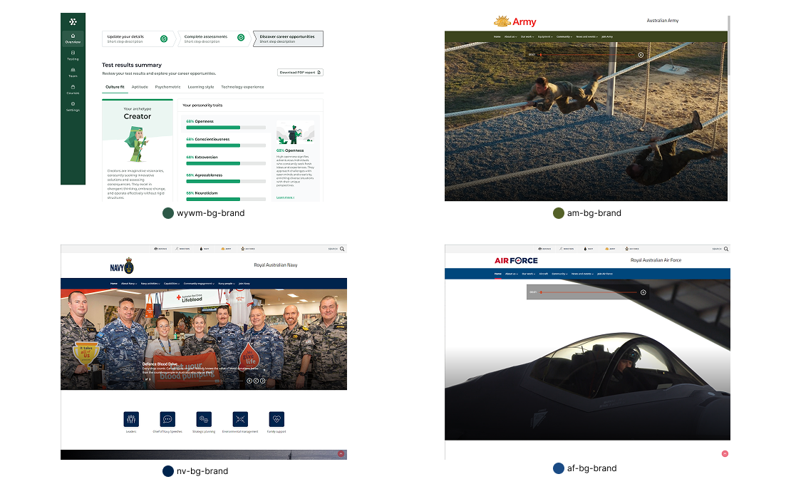
The primary challenge was inconsistency. Each of the four themes (WYWM, Australian Army, Australian Navy, Australian Airforce) had its own style guidelines but there was no shared structure. This led to many different button styles, typography, colour usage and spacing design. We were wasting a lot of time recreating components for each theme and the user experience suffered as a result. The products needed to reduce duplication, provide clear guidance and allow all four theme to coexist under a cohesive framework.
The primary goal was to create a shared foundation that could support multiple themes wihtout duplicating effort. This meants establishing design tokens for typography, colour and spacing while allowing flexibility and scalable. Success would measured by how quickly designers could apply new themes, adoption rates across the team and visible reductions in design inconsistencies.
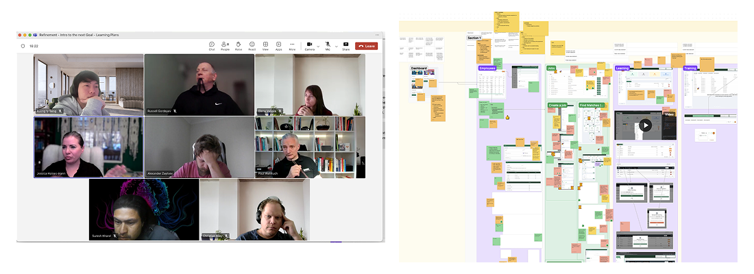
Rather than working on this alone, I knew that the key to success was to work in collboration with the development teams and product stackholders.
I set up a weekly catch-up with the team to maintain clear communication and alignment across design and development. During these sessions, we compiled and reviewed all existing products to capture their primary colours, typography and other foundation style, ensuring that Figma files and the live codebase stayed in sync. My focus was on aligning and implementing designs with real user needs while continuously identifying cross-product use cases and edge cases. This approach helped create a more consistent, user-focused and scalable product experience.
People who were involved: Product Owner, Full-stack developer & Front-end developer (Team A), Full-stack developer (Team B), Customer Success Account Manager, QA engineer, Product designer.
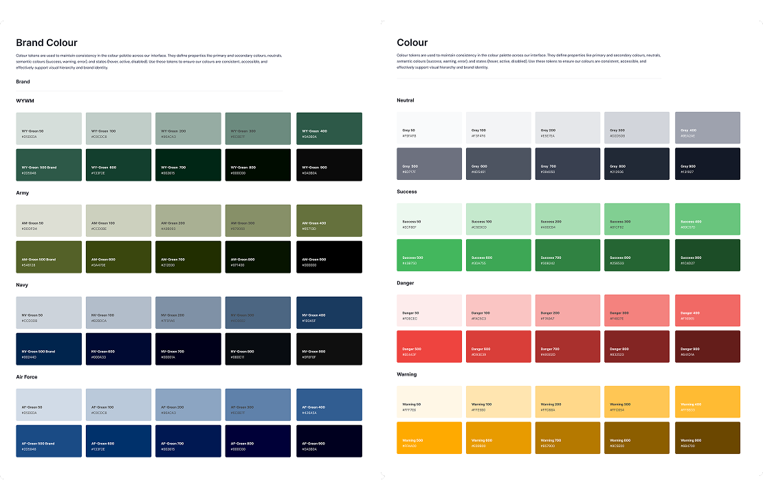
Before creating the design system, we first identified the primary
colours of each product and studied how every theme expressed its
visual identity. From these insights, we built a unified colour
palette that became the foundation of the new system. The palette
kept each product’s signature colours but standardised neutral
shades and ensured proper accessibility contrast. This gave
designers and developers a consistent framework to work from, while
still allowing the four themes to keep their own unique
personalities.
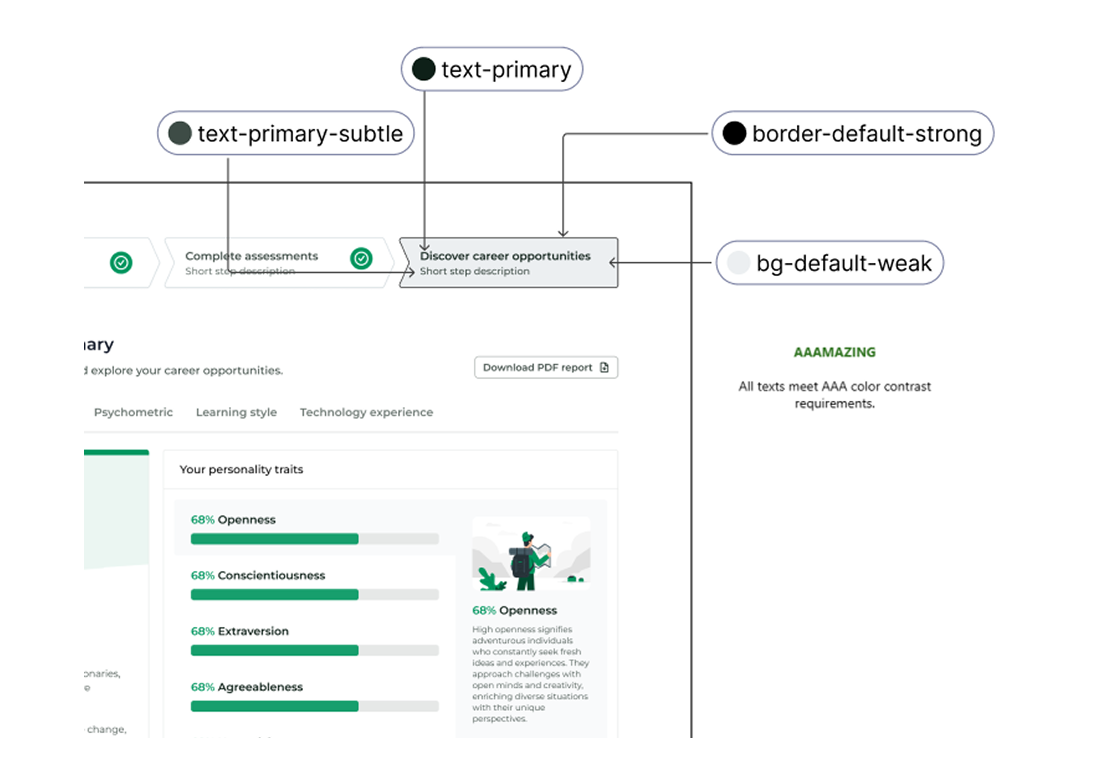
After building the unified colour palette, I made sure to rigorously test the colours for accessibility. Using the contrast-checking tools, I verified that the combinations of background and text met the WCAG standards for readability. This process included testing different states such as hover, active and disabled to ensure consistency across the system. By doing this early, we were able to confidently choose colours and text styles that worked together across all four themes, ensuring a more inclusive and accessible experience for all user.
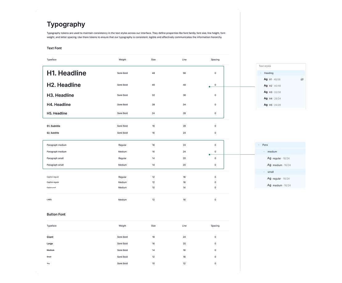
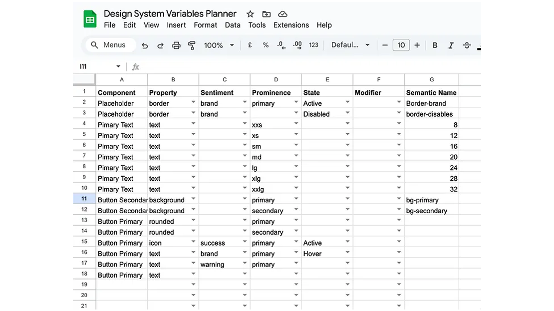
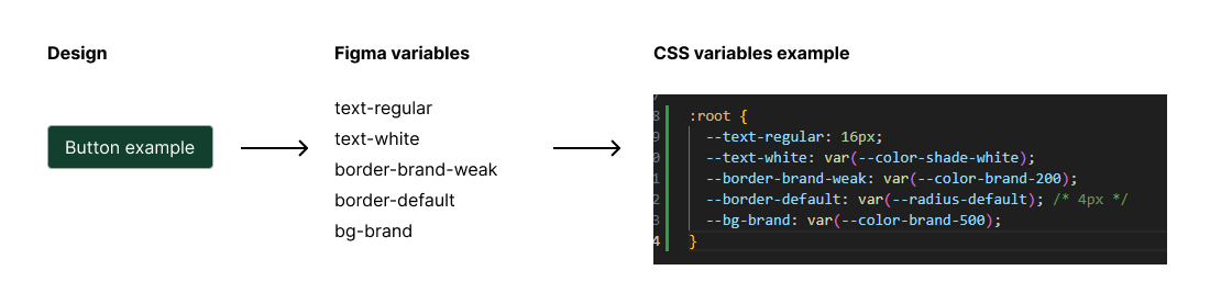
As part of building the design system, I created a variable planner in Excel to organise and manage our design tokens. This spreadsheet became the blueprint for how variables are named, structured and documented. By following a consistent naming framework, we ensured variables were not only easy to create but also easy to maintain and scale across multiple themes. This approach helped bridge the gap between design and development, giving both teams a single source of truth. It also doubled as documentation, so future designers and engineers could quickly understand and apply the variables without confusion.
The new multi-themed design system made everything feel much more consistent and efficient. Designers could switch between any of the four themes in seconds, without having to rebuild components or pages from scratch. This cut down on duplication, reduced errors, and created a much more cohesive look and feel across the entire product. Because the system was built in a modular way, it’s also ready to handle new themes in the future without adding extra work.
By creating a multi-themed design system for WithYouWithMe, we addressed the core problem of UI inconsistency and reduced duplicated effort across four distinct themes. The system not only streamlined design workflows but also delivered a cohesive, scalable, and flexible framework that enables the product team to maintain quality and consistency as the platform continues to grow.
Looking back, I would introduce the variables planner much earlier in the process. Starting with a clear framework fro naming and organising design tokens from the start would have saved timem and reduced inconsistencies. I also see the value in showing the framework to the the developers early on, how the variables map directly to code so the developers can adopt them faster. By demonstrating this translation between design and development earlier in the process, I could have aligned both teams sooner and created an even smoother handoff process.